NCERT QUESTIONS AND ANSWERS
Answer the following questions, 1 to 10, choosing the correct answer
1.Bar diagram is a
(i) one-dimensional diagram
(ii) two-dimensional diagram
(iii) diagram with no dimension
(iv) none of the above
2.Data represented through a histogram can help in finding graphically the
(i) mean
(ii) mode
(iii) median
(iv) all the above
3.Ogives can be helpful in locating graphically the
(i) mode
(ii) mean
(iii) median
(iv) none of the above
4.Data represented through arithmetic line graph help in understanding
(i) long term trend
(ii) cyclicity in data
(iii) seasonality in data
(iv) all the above
Ans. 1. (i) 2. (ii) 3. (iii) 4. (iv)
5.Width of bars in a bar diagram need not be equal (True/False).
6.Width of rectangles in a histogram should essentially be equal (True/
False).
7.Histogram can only be formed with continuous classification of data
(True/False).
8.Histogram and column diagram are the same method of presentation of
data. (True/False)
9.Mode of a frequency distribution can be known graphically with the
help of histogram. (True/False)
10.Median of a frequency distribution cannot be known from the ogives.
(True/False)
Ans. 5.False 6.False 7.True 8.False 9.True 10.False
11.What kind of diagrams are more effective in representing the following?
(i) Monthly rainfall in a year
Ans (i) The monthly rainfall in a year can be best represented by a bar diagram as only one variable i.e. monthly rainfall is to be compared visually. The highest bar diagram indicates the highest rainfall in the corresponding month that is plotted on the x-axis.
(ii) Composition of the population of Delhi by religion
Ans Composition of the population of Delhi by religion can be represented by a simple bar diagram. Plotting different religion on the x-axis and the number of people on the y-axis, one can easily compare the number of the population religion-wise.
(iii) Components of cost in a factory.
Ans In order to represent different components of cost in a factory, a pie chart is more effective. The entire circle represents the total cost and various components of costs are shown by different portions of the circle
12.Suppose you want to emphasise the increase in the share of urban non-workers and lower level of urbanisation in India as shown in Example 4.2. How would you do it in the tabular form?
Ans.
| Share of Rural and Urban Non-workers in India | ||
| Non-workers in Urban | Non-workers in Rural | Total Non-workers Population |
| (1) | (2) | (3) = (1) + (2) |
| 19,31,38,837 | 42,96,00,032 | 62,27,38,869 |
Source: Census of India, 2001
We can infer from the above table that the absolute number of the rural non-workers is greater than the absolute number of the urban non-workers. The higher ( lower) share of the rural non-workers (urban non-workers) reveals lower degree of urbanisation in India.
NOTE: As there is no Example 4.2 in the book, so the following data have been adapted from Census of India, 2001.
13.How does the procedure of drawing a histogram differ when class intervals are unequal in comparison to equal class intervals in a frequency table?
Ans. A Histogram of equal class intervals has equal width of all rectangles indicating the same class intervals. In contrast, a Histogram of unequal class intervals has rectangles of varying width as per their corresponding class intervals. Before constructing a Histogram, frequencies of unequal class intervals are to be adjusted. The adjustment factor of each class is calculated with the following formula.
And the adjusted frequency will be calculated by dividing the original frequency by adjustment factor.
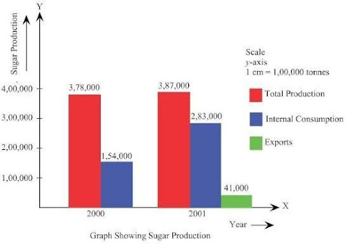
14.The Indian Sugar Mills Association reported that, ‘Sugar production during the first fortnight of December 2001 was about 3,87,000 tonnes, as against 3,78,000 tonnes during the same fortnight last year (2000).
The off-take of sugar from factories during the first fortnight of December 2001 was 2,83,000 tonnes for internal consumption and 41,000 tonnes for exports as against 1,54,000 tonnes for internal consumption and nil for exports during the same fortnight last season.’
- Present the data in tabular form.
Ans.
| Sugar Production in India | |||
| Month, Year | Total Production | Internal Consumption | Export of Sugar |
| (tonnes) | (tonnes) | (tonnes) | |
| Dec, 2000 | 3,78,000 | 1,54,000 | – |
| Dec, 2001 | 3,87,000 | 2,83,000 | 41,000 |
(ii) Suppose you were to present these data in diagrammatic form which of the diagrams would you use and why?
Ans. With a view to present the data diagrammatically the multiple bar diagram can be effectively used.
(iii) Present these data diagrammatically.
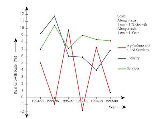
15.The following table shows the estimated sectoral real growth rates (percentage change over the previous year) in GDP at factor cost.
Agriculture and allied sectors Industry
| Year | Agriculture and allied sectors | Industry | Services |
| (1) | (2) | (3) | (4) |
| 1994–95 | 5.0 | 9.2 | 7.0 |
| 1995–96 | –0.9 | 11.8 | 10.3 |
| 1996–97 | 9.6 | 6.0 | 7.1 |
| 1997–98 | –1.9 | 5.9 | 9.0 |
| 1998–99 | 7.2 | 4.0 | 8.3 |
| 1999–2000 | 0.8 | 6.9 | 8.2 |
Represent the data as multiple time series graphs
Ans.